Map Shows Most People Can’t Afford A New Home In Their State
It turns out most of us can’t afford a new home in the states we live in.

While everything is more expensive right now due to record inflation, the housing market, in particular, has skyrocketed in unaffordability over the past few years. This is due to a number of recent changes — i.e., the pandemic and the inflation and labor and supply shortages that came with it — and longer-brewing crises like low housing stock and flat wages. Many folks moved out of their major cities to greener pastures: lower-priced homes in suburban or rural locales. And although the housing market is beginning to cool, a map shows that affording a new home is really, really hard. Here’s what you need to know.
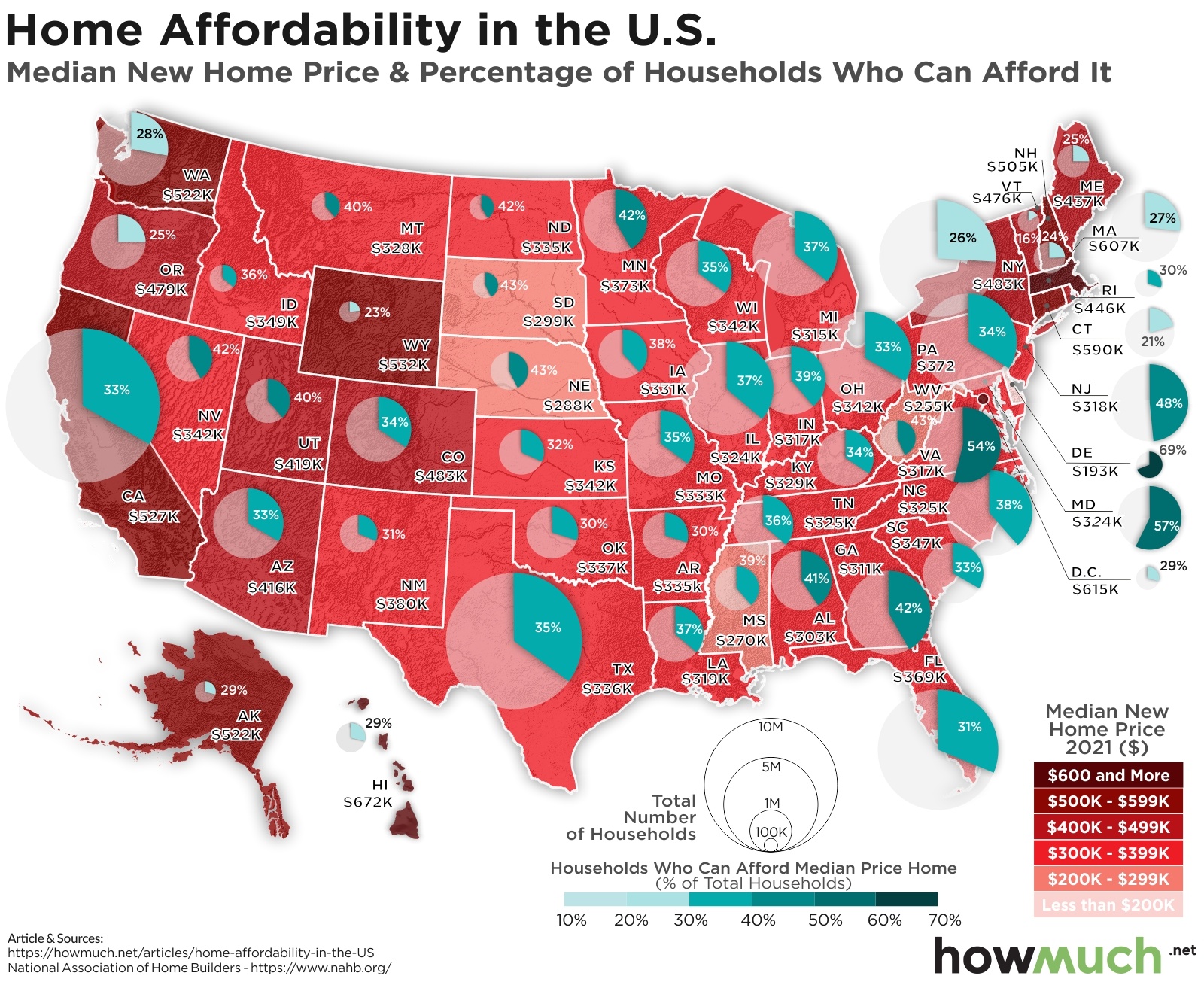
HowMuch.net, a financial literacy website, wanted to look into the home market and how realistic it is for Americans to be able to purchase a new home. Specifically, they analyzed home affordability in the United States, the median price of a new home in each state, and the percentage of households within that state that could afford it. What they found was it’s difficult to afford a new home — like impossibly so — in most states across the country.
In March of 2021, using contemporary data collected from a Special Study for Housing Economics by the National Association of Home Builders, HowMuch.net sorted through the information and created an easy-to-follow map.
“First, we color-coded each state based on the median new home price according to an index from the National Association of Home Builders,” the site explains. “Second, we overlaid a circle representing how many households live in each state.” The final piece of data is a shaded slice of the circle to show the percentage of households within that state that can afford a median-cost, new home.
“The result of our analysis is a detailed snapshot of the U.S. housing crisis from coast to coast,” HowMuch.net shares. To take a look at the map, scroll around in the widget below to explore.
When exploring the map, you’ll find that in New Mexico, for example, where the median cost of a new home is about $380,000, only 31% of people can afford it. In Nevada, on the other hand, where the median cost of a new home is $342,000, some 42% of potential homeowners can afford to buy a new home.
HowMuch.net
Other takeaways from the findings include:
- There are only three states where more than half of average earners can afford the average cost of a new build, including Delaware (69%), Maryland (57%), and Virginia (54%).
- Delaware, which is the most affordable place in the country, is likely only top of the list because the median home cost in the state is far lower than average at $193,000. Compare this with California, where the median home cost is $527,000, and only 33% of average earners can afford a new home.
- Even then, the data goes deeper. “The same proportion of households can afford a home in California as Arizona (33%),” HowMuch.net writes, “but the median new home price is vastly different ($527K vs. $416K, respectively).” That’s likely due to lower wages in Arizona — and shows how in many states where homes might be cheaper, wages might not even be able to match those home costs.
- The five states where the least percentage of households can afford a new home include Maine (25%), New Hampshire (24%), Wyoming (23%), Connecticut (21%), and the least affordable state in the country is Vermont, with only 16% of households able to afford a mortgage for a new home with these houses having a median price of $476,000.
“In the vast majority of places, hardly anyone is in a position to pay the mortgage on a typical single-family home,” HowMuch.net notes.
To check out more and see the comprehensive map, visit HowMuch.net.
This article was originally published on
