‘Don’t Touch My Baby’ Signs Don’t Work Because Etsy is Too Cute
We asked a professor of signage and visual marketing whether "Don't Touch My Baby" signs are worth it, and how to improve upon them

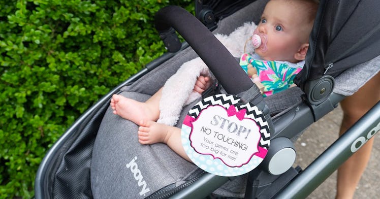
You don’t really want anyone touching your baby—let alone random strangers. Cooing from a safe distance, or tactfully tickling a sock-covered foot is usually fine. But once an adult’s grimy hand is on a trajectory for your baby’s cheek, you’re tempted to grab it. You don’t. But you kinda wish you did. You feel weird about it. That is why, at least on the surface, hanging a “Don’t Touch My Baby” sign from your stroller makes some sense. The latest big trend in parenting gear appeals to a parental impulse, but that, unfortunately, does not mean it works in practice.
Even as these trespassing signs take Etsy by storm, creating a mini-industry of baby-related signage, experts are voicing concern. “‘Don’t Touch’ signs tend to have cute images and rhyming messages,” explains James Kellaris, a professor of signage and visual marketing at the University of Cincinnati. “I predict the baby gets touched before people process the sign.”
There’s an entire field of research dedicated to studying signage, but there is still “no magic formula for an effective sign,” Kellaris says. “Because communication depends on the sign, the person seeing it, and the context in which it is encountered.” A shoddy plywood sign that says EAT may do a perfectly good job in front a roadside diner, but would probably be a disservice to an upscale restaurant in the city. That said, there are a handful of general rules of good signage.
“Effective signs are legible from a distance, easy to process at a glance, positioned to advantage, and composed of aesthetically congruent elements,” Kellaris says. “For example, the background color should mean something in relation to the message.”
The bulk of available “Don’t Touch My Baby” signs are adorable and cheerful looking — being, after all, baby gear — which means that the medium is bound to undermine the message. More aggressive signage might work better but would also spoil the general cute baby aesthetic.
There’s a simple reason that design matters when it comes to signage. We face constant information overload, so our brains filter out most of what our eyes see. We generally notice signs, however, due to a phenomenon known as the Authority Effect. “People tend to regard signs as an authoritative source,” Kellaris says. “And authority triggers automatic compliance.” Designing an effective sign, then, is all about taking advantage of the Authority Effect, and shifting attention toward the message quickly and efficiently.
The current spate of “Don’t Touch My Baby” signs are generally word-heavy, with cute phrases and explanations, such as Stop! If you cough or sneeze, don’t touch little me! Mommy thanks you very much. “Keep the text super short,” Kellaris suggests. “‘Do not touch’ with or without a ‘Please.'” And sign designers shouldn’t beat around the bush, Kellaris adds. In lieu of cute rhymes and baby imagery, it should be made clear that the sign means STOP. “Instead of an image of an adorable teddy bear to attract attention and soften the social blow, consider using a universally recognized symbol, such as a medical alert symbol, warning, or stop icon.”
So, will “Don’t Touch My Baby Signs” prevent gross strangers from touching your baby? Likely not, unless the signs conform to the near-universal rules of good design. Red would help. An octagon would help. But finding those signs is difficult.
Besides, Kellaris is not convinced that every message should be sent by way of signage. In this case, he suggests that parents hover over their babies and bat away germ-covered hands themselves. “Signs are no substitute for verbal communication in this context,” Kellaris says. “If mama bear doesn’t want her cub touched, she should feel at liberty to growl!”
This article was originally published on