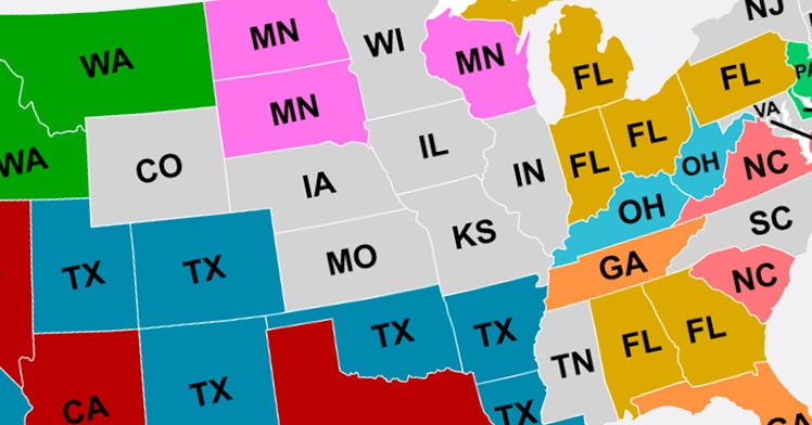
This Map Reveals Where Everyone Is Moving To In The United States
Florida, Texas, and California were the most popular destinations.

Last year, nearly 7.4 million Americans moved to a different state. The knowledge of that mass migration is possible because U.S. Census Bureau keeps track of this sort of thing with its American Community Survey, an ongoing data collection effort that’s aggregated yearly, providing more up-to-date information than the decennial, Constitution-mandated census does.
An enterprising Reddit user who goes by u/shereth78 decided to take that data and create a map that shows the most popular destination for residents of particular states who moved to a different state last year. In other words, the at-first-confusing map shows each state labeled with the state that it lost the most residents to in 2019. So, as it appears, Texans lost a lot of residents to California — and California lost a lot of residents to Texas.
u/shereth78
A few things stand out when one examines the map. First, most states lost the most residents to neighboring states, suggesting that folks might be more willing to change states than change regions. The main exceptions are Florida (a perpetually popular retirement destination for Northeasterners) and the aforementioned California and Texas, large states with more economic activity and therefore job opportunities than most of their peers.
The colors on the map are the only 10 states on the map that are featured multiple times, with California in red, Texas in blue, Washington in green, and so forth. Unfortunately, Tennessee, Kansas, and Missouri, for example, are in grey, because they were only the top destination for folks moving in one state each. Ouch.
Minnesota is a popular destination in the Midwest, as is Washington in the Pacific Northwest. Kansas and Missouri are each other’s most popular destinations, possibly because the Kansas City metropolitan area straddles both, making it easy to live in one state and work in another than it is in most cities.
Of course, the map doesn’t show how many people are moving from state to state or how large the margin between the most popular destination and the others are. But as an interesting distraction based on real data, you could do a lot worse than pondering, say, why more Massachusettsans moved to New Hampshire than New York last year.