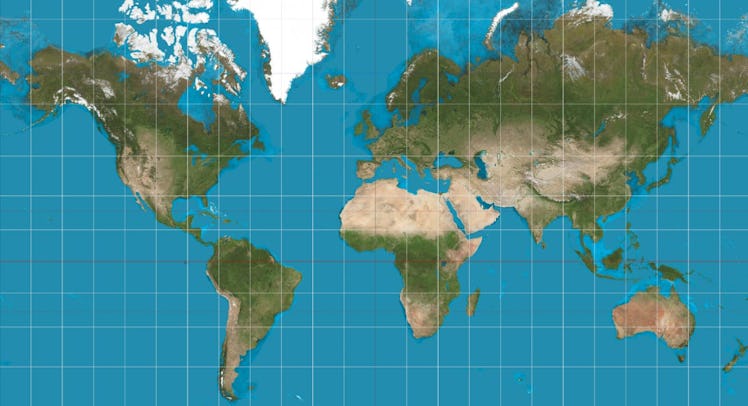
Boston Is The First Public School District To Get Rid Of This BS World Map
They're distancing themselves.

The maps hanging in your childhood social studies classes were probably Eurocentric and — what a surprise — wrong. For decades, most public school districts used the Mercator projection. Named after Flemish cartographer Gerardus Mercator who created the map in 1569, it was intended to highlight trade routes. In doing so, however, he exaggerated Europe and drastically shrunk Africa and South America.
Many schools across the country have opted out of this inaccurate map, but the Boston Public School District recently became the first to officially replace it with the Gall-Peters projection. While the Gall-Peters map slightly distorts shape for the sake of scale, it’s a much better representation of continents’ actual sizes. Such as Africa. Seriously, do you know how big Africa actually is? Hopefully, Boston’s decision will persuade other districts to do the same.
Cartography is a tricky business and the Mercator is certainly not the first map to make its way into schools. Here are 5 maps that misrepresent themselves.
Mercator Projection
As previously mentioned, Mercator created this for nautical navigation and to depict trade routes. But guess what? Mercator didn’t even rely on it when he was studying relative area sizes instead of navigation. That’s because his map the distorts landmasses the farther you get from the equator. It’s why Europe and North America appear larger, Greenland is the same size as Africa, Finland is longer than India, and Antarctica appears to be infinite.
Hobo-Dyer Projection
Similar to the Gall-Peters projection, Hobo-Dyer is a cylindrical map that aims to give an equal-area presentation of the world. The projection was commissioned in 2002 as a modification of the 1910 Behrmann projection and is billed as more “visually pleasing” than other equal-area presentation maps. Even though it compresses the North and South Poles more than its counterparts, at least Greenland is in proportion.
Wikipedia
Cassini Projection
Created by Cesar-Francois Cassini de Thury in 1775, this map’s rotation replaces the equator with the central meridian. Or, for those who didn’t major in cartography, it replaces that line that goes around the planet with one that goes straight through the planet. The effect? Those north-south longitudinals lines are distorted. It’s useful as an ellipsoid model of the earth, which tends to be more accurate than spherical representations.
Universal Beginner United States Map
Most U.S. maps quarantine Alaska and Hawaii to small boxed sections and focus instead on the continental United States. As a result, many maps misrepresent their size. The Universal Beginner United States Map makes this mistake by showing Alaska as roughly the size of New Mexico, when in reality, it’s more like 2 Texases. And it has about 27 million fewer people.
The World Explorer Carpet Map
This map aims to be cute rather than educational, which isn’t a great look in education. Europe is too big, South America too small, and Greenland, again, is massive. (Do cartographers have some sort of secret crush on Greenland?) It does, however, accurately scale the U.S. and Australia as the same size, which is more than some others can say.
This article was originally published on