Cellphone Data Map Shows Which Americans Are Ignoring Quarantine
Our cellphones go with us everywhere, even when we're not supposed to leave.

Want to know exactly how your community is doing in terms of social distancing? A new interactive map is here to help.
It’s not fun when you’re stuck inside, but many people are, and it’s essential so that we can help slow the pandemic. Several states are under stay-at-home orders to help curb the coronavirus pandemic, and we know it will be this way for at least another month, if not longer. The importance of quarantining, especially when sick, is no joke, and yet new data can help pinpoint which Americans are ignoring the orders. Here are the details.
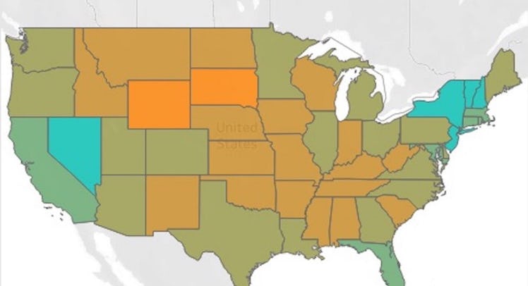
Unacast, a company that collects and analyzes GPS phone location data, has revealed its “Social Distancing Scoreboard,” which tallies and shows which states are listening and playing by the quarantine rules. They tallied up a color-coded map by comparing current data on locations to the same areas a typical day before the pandemic began. They took note of the changes spent around the house, how distance traveled changed, and clusters of activity. (Basically, if phones were remaining in the same place, there’s a good bet people were abiding by social distancing regulations and staying home.)
According to the data, the District of Columbia, Alaska, Nevada, New Jersey, and New York are doing a much better job listening to the quarantine rules and staying in their homes. The data from millions of cellphones also shows that North Dakota, South Dakota, Idaho, Montana, and Wyoming seem to be more likely to be ignoring the rules and recommendations on quarantining.
On the map, states colored in the teal blue are ones doing a better job quarantining, while the ones in orange aren’t isolating, according to the data. The interactive map allows you to narrow down the data even further to take a look at how your county is doing and see the percentage details of travel change. It also offers a grading system from “A” to “F”; “A” meaning there’s been more than a 40 percent decrease in social behavior and “F” meaning less than 10 percent.
Visit Unacast’s website to view the interactive map and see how your community is doing in terms of social distancing.
This article was originally published on